
Category
Case Study, UX/UI
Worked with a team to redesign the shopping experience for a pilot app. Our case study is in sections consisting of our product concept, user research, modeling, design, prototyping as well as the UX evaluation. Our Official UX Case Study
The intention of this was to add a shopping system to the existing app. To preface, the Pilot Program that we are developing for Sporty’s is an additional layer to the existing application Sporty’s currently offers. Their application involves in depth video tutorials teaching their users how to become well trained pilots. Our proposed modifications will allow users to view and order the specific products seen in these video tutorials, giving the pilots in training the appropriate tools and products necessary to feel like professionals. Not only will this supplement their knowledge of flying and the specific products are available to them, but it will also greatly improve the marketing effectiveness in Sportys’ gearing them towards selling key products to the demographics of these pilots. Through our modifications to this app, users will be able to order things directly to their door using their already created sporty’s account information.
Before
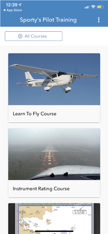
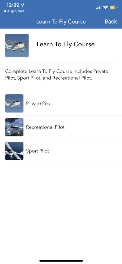
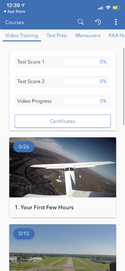
This is what the Sporty’s training platform looked like before. Quite simple essentially just a video tutorial application. Take note there is no marketplace tab.
Client Meeting
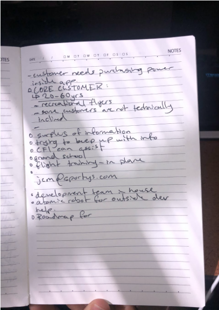
Our team met the supervisor at Sporty’s – J.C Mayerle, Director of Communications and User Experience. We began with Analyzation. Figuring out what exactly needs to get done, essential goals, and necessary tasks to accomplish.
Work Affinity Activity Diagram (WAAD)
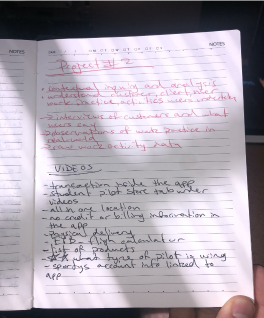
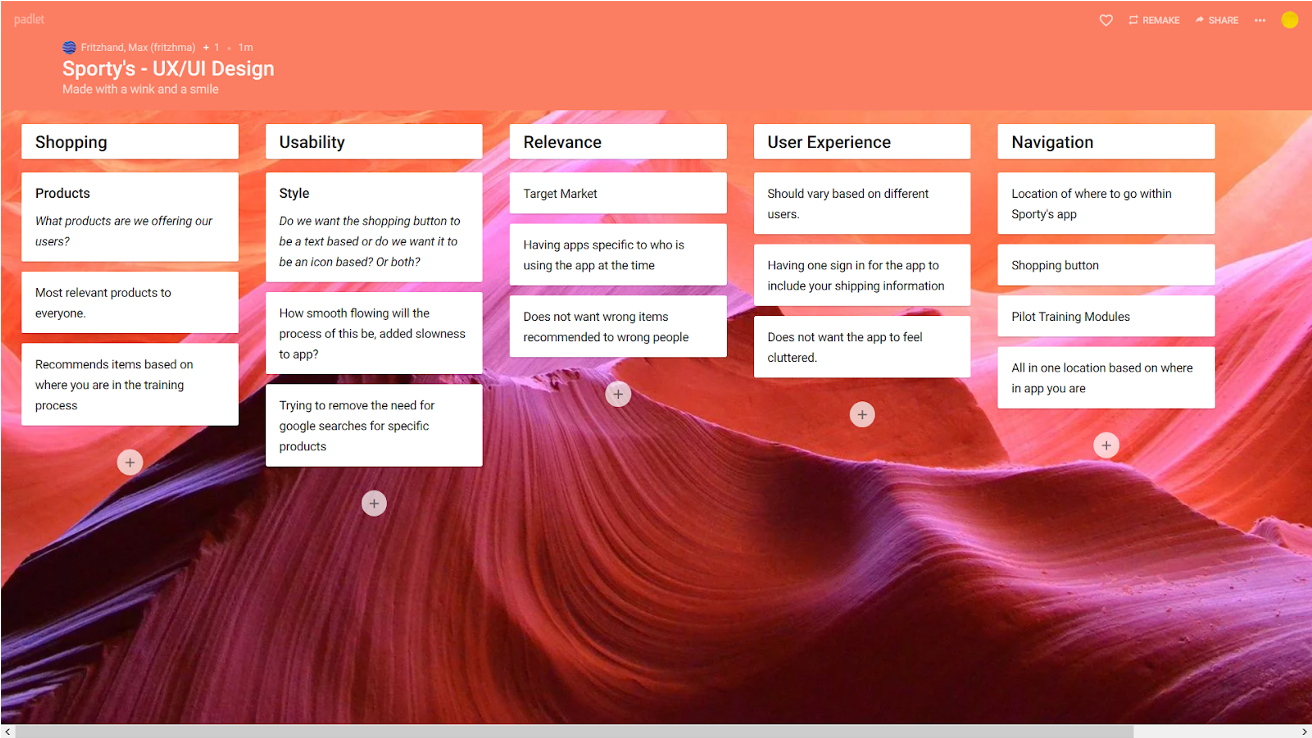
Contextual inquiry and analysis of the app. Observations of users and how the app works and how what we are adding should look.
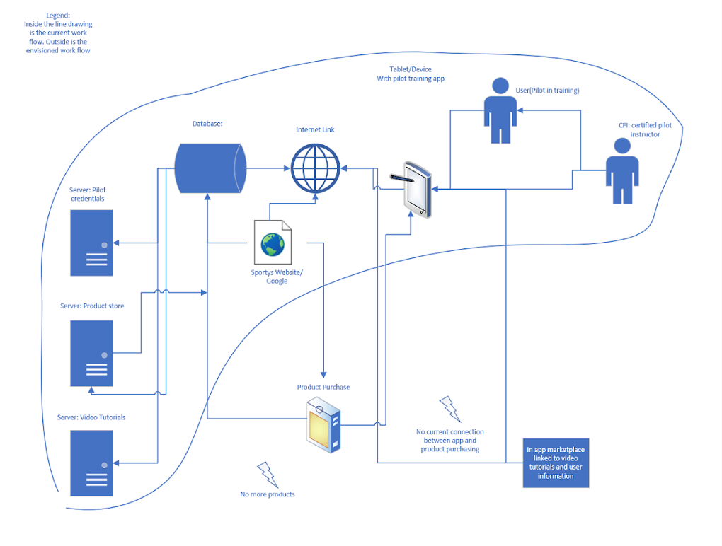
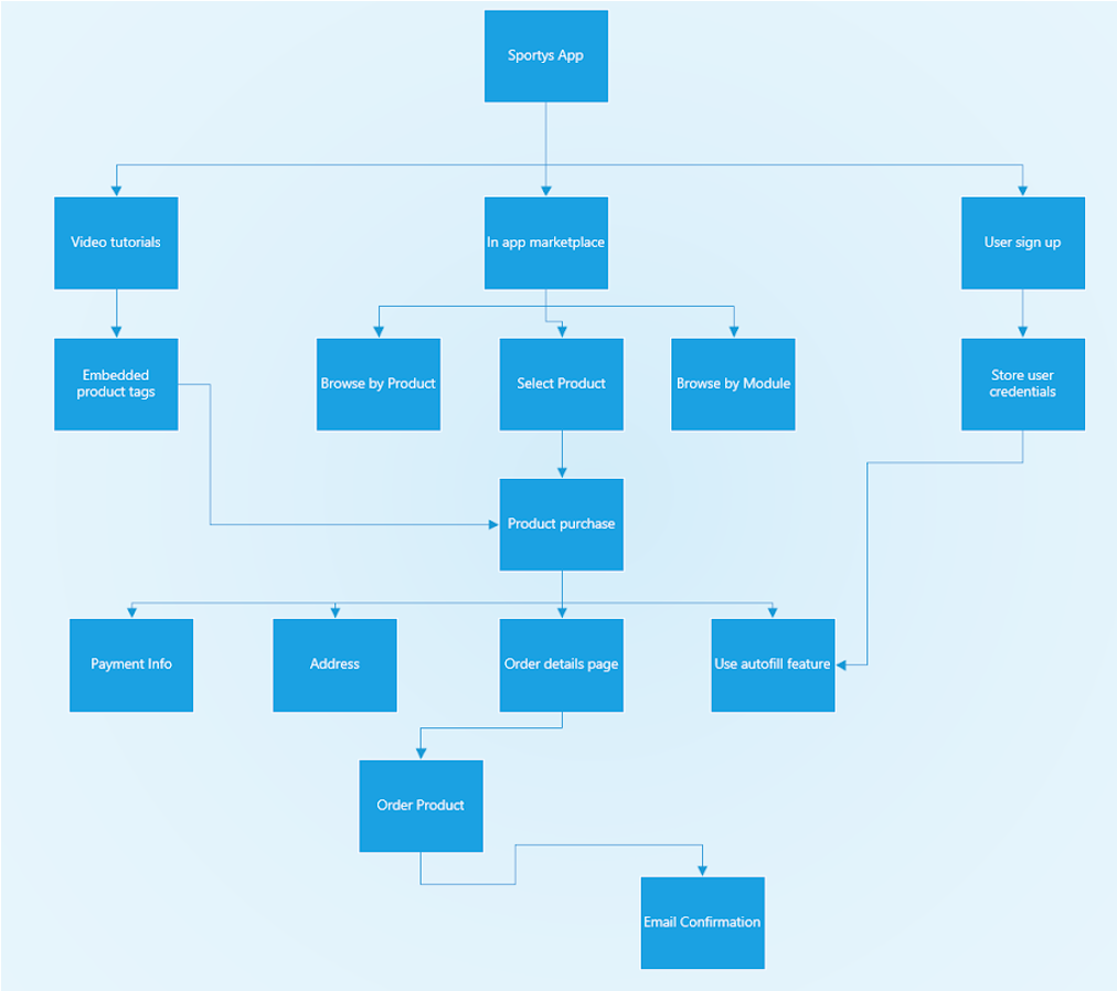
Hybrid Model: Envisioned and Current Workflow
Logical architecture for how the platform currently works, and then the network topology for the envisioned additions to the platform. The information within the line drawing represents the current work. Outside the envisioned workflow.
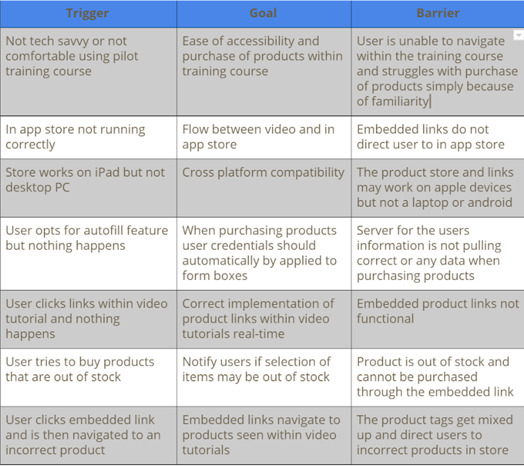
Barrier Summary
Potential problems that might arise from our design concepts and planning stages. Ease of access for all types of users, cross-platform functionality, and backend to frontend operations.
Hierarchical Task Inventory (HTI) Model
A hierarchical task analysis provides an understanding of the task’s users need to perform to achieve certain goals. In user experience, you can use HTI analysis to describe the interactions between a user and a software system. This is great for developers for understanding how a user interacts with a system. Two essential tasks for the purchasing of products. Integrated marketplace and embedded product tags.
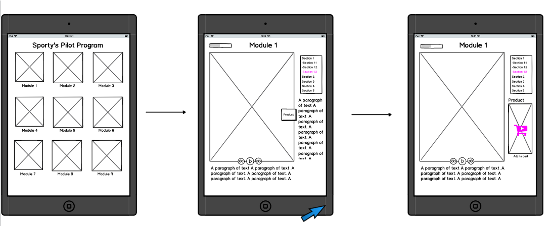
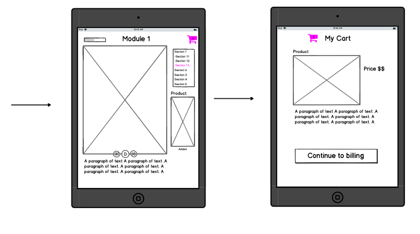
Low Fidelity Wireframes
The wireframes gave a better visualization of what the process might look like. Designed in Balsamiq.
High Fidelity Prototype
Heuristic Evaluation
Heuristic Evaluation is a way to test whether a website is user friendly. We found that people were having a hard time buying items. Realized no items were being bought. Adobe XD showed the shopping experience through testers. All testers like the fluidity of it. They liked how Sporty’s has everything and includes order numbers. They suggested adding other tabs.
Challenges
- Finding a suitable client
- Setting up initial meeting was stressful but once we sat in the room and began talking things began to flow.
- Learning new software (AdobeXD, Balsamiq) to create wireframes & high fidelity prototypes
Lessons Learned
- Communication with the client is key. Ideas change throughout the creative process.
- Gather as much initial data early on as possible; helps to create future interaction designs and prototypes.
- Taking on too big of a workload and too many projects can cause stress for everybody.
- Divide and conquer tasks. Don’t have two teammates working on a singular task, split up workload to maximize efficiency and results.